 krites
 Pioneering
I do a surprising amount of my development from a phone. Not the typing, I’m not a masochist, but the reviewing… the “does this actually look right” poking at a running build in the gaps between the rest of life. The setup is simple enough: Tailscale to reach my homelab, Termux for a terminal, and Claude Code’s remote session so my actual dev machine does the heavy lifting while I just hold the small screen. It means I can pick a project back up in a supermarket car park while my wife nips in for the milk. Which is more or less where this story starts.
I’d been pushing the layout around in krites, the photo-culler I built for my wife. It’s a command-line tool first and foremost, but there’s a small studio on top for the bit where you actually want to look at the photos. And looking at photos is a big-screen job. You cull a wedding on a 27-inch monitor, not a phone. So the studio is, unapologetically, a desktop thing.
The trouble is, I wasn’t at a desk. I was on my Pixel 9, in the car, reviewing the morning’s work. And the grid… would not behave.
The cull grid is the heart of the studio: a wall of thumbnails you skim, flag and bin. On the desktop it’s lovely. On a phone it had collapsed into something between a ransom note and a game of Tetris nobody was winning. Thumbnails overlapping their captions, a column count that made no sense for the width, controls shoved somewhere south of useful. The kind of thing you’d never ship if you’d looked at it… and I’d never looked at it, because why would I review a desktop tool on a phone?
Except that’s exactly what I do. So I did.
I build krites for a big monitor. I review it from whatever’s in my pocket. Those are never the same place, and this bug had been sitting in the gap between them the whole time, perfectly happy, on a layout I’d simply never looked at.
I wanted to be sure it really was just the narrow breakpoint and not something I’d broken everywhere, so I reached for the other end of my travelling kit: a Galaxy Tab S10 Ultra, which at fourteen inches is less a tablet than a small desk you can hold. The desktop layout on that was fine. Properly fine. So this was purely a responsive problem, the grid simply never having been told what to do when it ran out of room.
The fix took several goes, all of them snapped from the phone between other errands, and the goes are the better story than any tidy “and then I fixed the CSS.”
First I tried shoving the grid into a narrow rail down the left, with the review pane beside it.
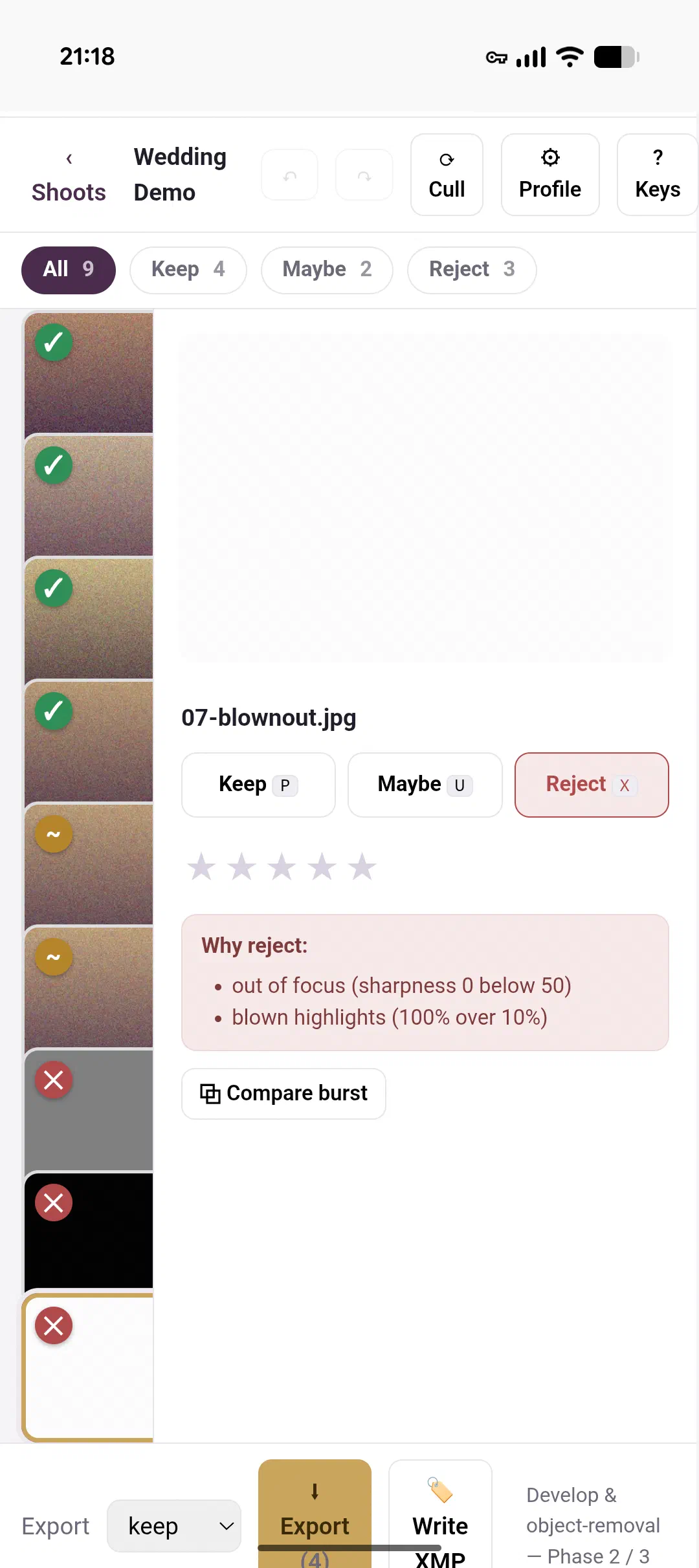
Then a proper grid up top with the preview below it, which was closer.
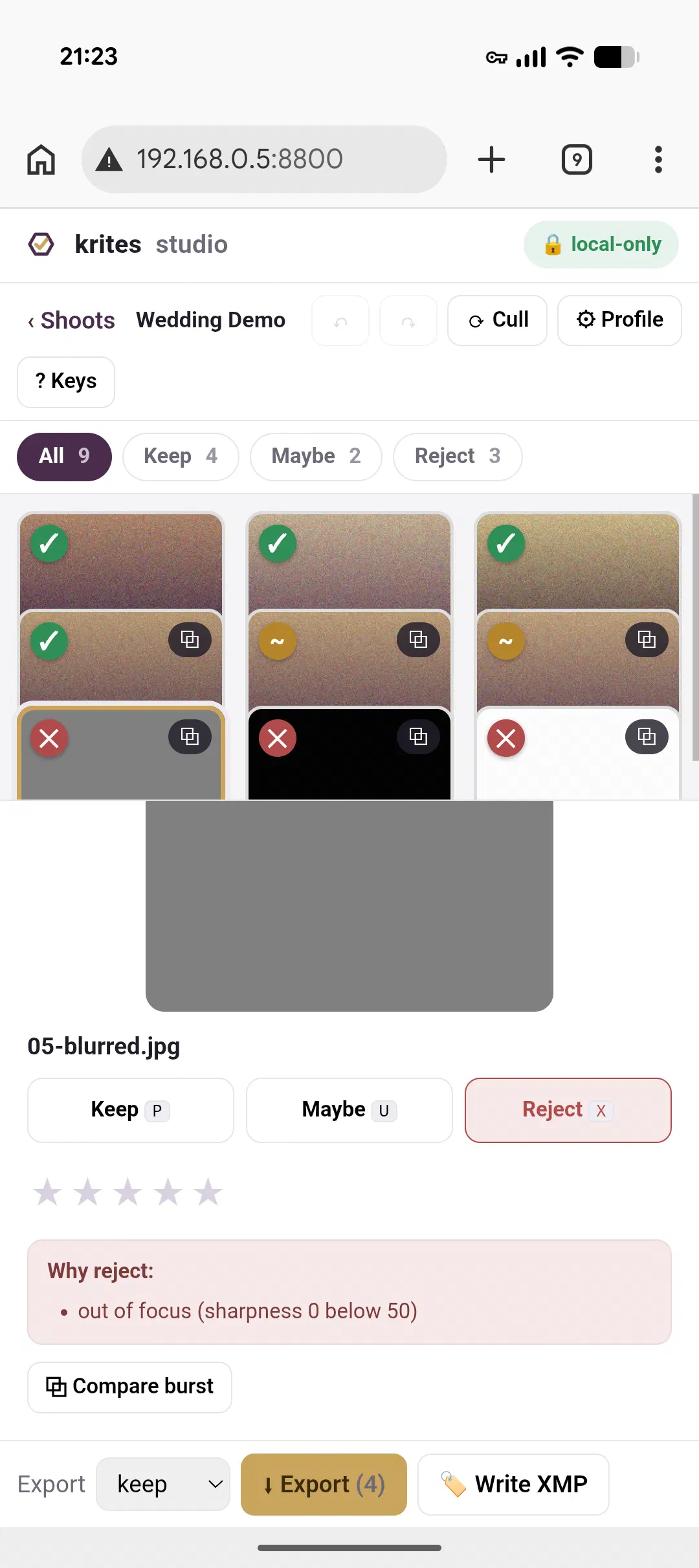
And then, because there is always one, a fix for the tile sizing backfired and collapsed every thumbnail into a coloured sliver.
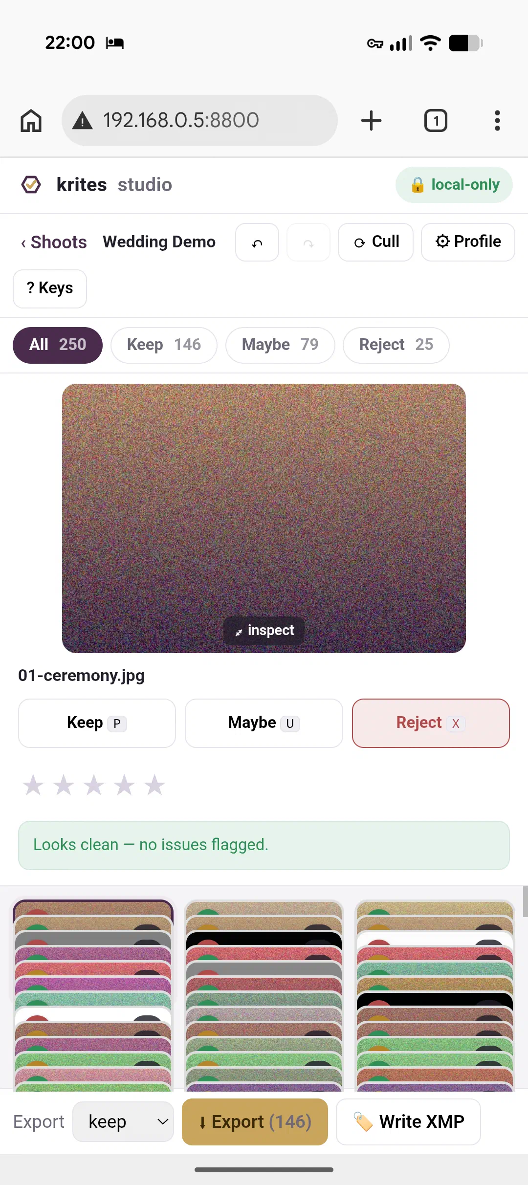
The version that finally held was the boring one. Put an explicit row height and an aspect ratio on the tiles so they can’t collapse, let the columns drop away as the viewport narrows, fall back to a single column when there’s genuinely no room for more, and keep the controls reachable with a thumb instead of assuming a mouse. Nothing clever. Just actually accounting for the small screen instead of pretending it wouldn’t happen.
The lesson I took away wasn’t really about CSS, though. It was about where I work. The homelab-in-your-pocket setup started as a convenience, a way to not lose an hour just because I was away from the desk. But it turns out it’s also a permanent, accidental test rig for exactly the conditions I’d never sit down and recreate on purpose. I am, most days, my own worst-case user: wrong screen, one hand, half my attention on the milk.
krites is a tool you’re meant to use at a desk. As it happens, the best way I’ve found to catch its away-from-the-desk bugs is to almost never be at one.