Recruiting people is effing hard!
That’s all… I’ll get back to reading through CVs now and let you get on with your day!
Medicines Discovery Catapult is, at the time of writing, recruiting Software Engineers, and as “Head of” it falls to me to start filtering through the CVs that land in my inbox. But what a mess! I get all sorts, from 1-page masterpieces that look amazing and all glossy, but tell me nothing about the individual to 10 pages of war and peace that have so much in it spanning 20 years of experience that 70% is actually completely irrelevant to the job they have applied for.
So now I get to say that this is what the perfect portrait of a CV should look like… I’m sorry to disappoint but I don’t think there is such a thing as a “perfect” CV. It’s far too subjective and open to interpretation. Instead, I’m gonna rip apart my own CV and explain why I chose to write it like I have and justify reasons why I would expect to see similar things on the CVs I am forced to read.
If you want the “TL;DR” version you can find a copy of my CV at https://docs.google.com/document/d/1MM_6nXIVU_wbrvkhdGL5xaJEwc46L7JblUqUot_g1ec but if you have gotten this far you may as well stick around and read the rest. I promise it won’t take long.
The Basics
OK! let’s start with some general observations I follow with regard to my own CV. Then we can get into the nitty-gritty of how bad mine is!
Recruiters
Love them or loathe them they are a part of the recruitment ecosystem and they will help you get hired. When you send them a copy of your CV bear in mind that they will most likely try to squeeze it into a format that will include their own branding and a cover sheet with some pertinent details on it. They may also then start redacting information off your CV in an effort to anonymise you. It is also possible that they will use the same CV for multiple roles meaning you will need to insist that they send your tailored CV if you are really bothered about winning a specific position.
Make sure to discuss this with your recruiter before having them put you forward for a role you are keen on.
Keeping Up to Date
Design your CV so that it is easy to tweak and update! Keeping your CV up to date is essential, and I don’t mean just adding your last role when you finally get fed up with your current employer abusing your good nature and rage quit!
Keeping your CV in top form means that you need to review the entire thing whenever you make an update. As your career progresses you will find that your perspective will change on what previous roles consisted of and how they would impact/reflect on the position you now desire.
You will also find that an up-to-date CV is easier to tailor to any specific job you might be applying for
Prettiness

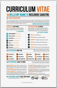
I know his name is Riccardo, but I’m struggling to focus on anything else
Having a pretty CV is great! and if creativity is relevant to the vacancy you are hoping to fill then go for it… make it gorgeous. It is however very subjective so make sure that you understand what your potential employer is looking for. Sometimes less is more, especially considering they may be scanning through hundreds of CVs. If they have to spend half an hour looking for something specific, then it’s gotten lost in all that creativity. If you want to see some gorgeous-looking CVs take a look at https://weare.guru/creative-cvs/ all of them are creative and beautiful…
But… they could take 20 minutes, or more, for someone to read and extract the right information. Which will waste a lot of time for your potential new boss. Plus we are talking about technical CVs and I am not the most creative of individuals, so keeping it clean and well formatted with consistent fonts usage and sizing
Length
I’ve heard a lot of people say different things about how long your CV should be. 1 side of A4… 2 sides of A4 but only if it’s printed double-sided, even “length doesn’t matter” because the more information you put in the better.
I would recommend taking a middle-of-the-road approach. Keeping things concise is paramount… but if you need 3 or 4 pages then that’s OK… as long as you make the content captivating and interesting for the reader, that is what matters
![]()
This one feels like it should be a “no brainier”… Make sure to submit your CV as a PDF!
There are two very good reasons behind this. First, it ensures that the reader will view it exactly as you intended. If you send it over as a Word, Google, OpenOffice or other such documents, then you are not guaranteed the reader will be using the exact same tools. I for one don’t use Word and an awful lot of presentation is lost because someone used a fancy word feature or have a font that I can’t get hold of.
Second, While it is not impossible it discourages recruiters from tampering with it and spoiling all your hard work. I have known only a few recruiters in my time that are willing to learn (or pay for) a good PDF editing suite. It is possible for them to alter things, but they tend to have to jump through hoops.
Beginnings

And so we have the start of My CV. Looks pretty boring, doesn’t it? Black text on a white background. Nothing fancy!
We have some basic contact details that can be used to contact me and a very short profile statement. That is all I feel an employer needs to see before we get into the next section of my CV. On the surface, it doesn’t actually say much but lets scratch a little deeper.
Font
I have specifically chosen a font that I think looks clean and professional, With a nice easy typeface, it becomes easy for an employer to scan the CV. I keep my CV in Google Docs so I went with Raleway, which I think is nice, clean, professional and easy to read.
I’ve also chosen consistent font sizes and spacing;
- 16 for the main title
- 14 for headings
- 12 for subheadings
- 11 for everything else
Limiting Liability

Middle-aged, liberal, heterosexual white male programmer Swipe right to Hire Me!!! Please!
It may sound odd but I put as little personal information in my CV as possible. Hence why just my name and contact details exist. I don’t mention my age, gender, race, driver status or political preferences. People come with inherent biases, that is just a fact of life. so putting as little as possible negates triggering these biases.
I’ve seen people put all sorts of information into CVs… a personal bugbear is photos. As they can introduce a massive amount of opinion in the eyes of the beholder. Think Tinder but for recruitment!
So unless specifically asked for I would strongly recommend keeping it to a minimum and using the space it would consume in selling the things that matter.
Profile statement
1 paragraph! that’s all I needed to say regarding what is effectively a personal statement. This is not a UCAS application and I don’t need to detail a million things about myself. What is to come next will be the real sales pitch
My profile statement focuses specifically on what my future employer is going to get from me if they hire me. Passion! It is a statement of intent, specifically written to demonstrate that I will strive to bring my “A game” to anything I do in the future and also that I intend to encourage those around me to do the same. In effect, it is the opening line to what is a sales pitch.
I could expand on this to state other goals and ambitions but that would just detract from the main objective of the CV. Plus we will get an opportunity to elaborate later on in the recruitment process.
Skills
Now we come to the meat and bones of the CV. This is the headline! the bit that you will tailor the most in order to impress whoever is scheduling those interviews and guarantee you a chance to shine. If you can make this captivating enough for the person you need to impress they will then be more than happy to read the rest

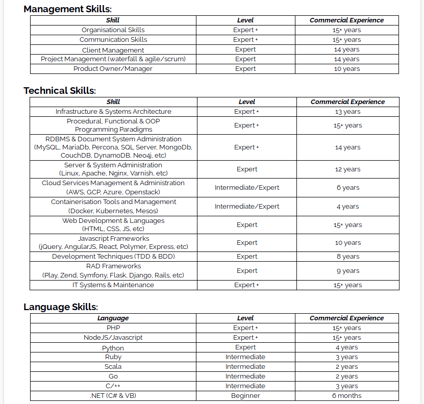
My CV has a LOT of skills listed. This is mainly because I’m a show off more than anything else and in reality, I will tailor this heavily to suit whatever role I’m applying for. For example, if it doesn’t have a requirement for managerial skills I would drop that section entirely. Depending on the required attributes and skills asked for I would happily add/remove bits to any section of my skills.
With different types of skills, I will define them differently. As you can see I am quite generic with Managerial skills. A lot of people understand these and are looking for confidence in your ability to do certain types of tasks. Technical skills define different aspects of what I do that are not specifically tied to languages. It can be very difficult to be curt and to the point here. I favour labelling a technology area and then listing a few of the most prominent or recent items from my repertoire. A bad example on my CV is databases… I can use quite a few as you can see, but in reality, I’ve been greedy by listing MySQL, MariaDB & Percona… they are all effectively connected to each other, but my need to show off is far too much for me to resist.
Experience
When I first started out as a Dev I had a hiring manager who once told me that most of the time the main thing he wanted to see was;
- did the applicant have the skills he wanted
- what was the candidates’ personal assessment of their ability
- how much genuine commercial experience do they have
Three really simple things that stuck with me. So the next time I came to write my CV I added a table for Skills which had only a few things on it back then but has grown massively over the years. I’ve tweaked and tailored it over the years, adding and removing things that were relevant as needed.

By quite clearly labelling my own perception of my skills, I give the person reading it an indication of my potential value. It allows them to tailor the interviews and technical tests to fit me as an individual. It also acts as a double-edged sword as the higher I grade myself the more chance of falling flat on my face when I get asked a question I can’t answer… So it’s always better to try and be accurate, but also not to be timid, there are always other competitors in the recruitment race.
I favour using really simple words to identify my skill level; beginner, intermediate, expert and expert+. It makes it simple for the reader to gauge and also allows me to mix the terms around
Stating how many years of commercial experience you have lets the reader understand your commercial experience. The number of times I’ve had recruiters do a typical keyword match and see that I mention c# once on my CV and then try to wave a job advert under my nose. I did .NET for 6 months 10 odd years ago. I legitimately can claim that experience, but it should not be the core on which I base my next adventure.
As a useful side effect, by stating a duration in years prompts me to review and update my CV regularly to keep it up to date.
Previous Employment
By this point, I’m hoping that I’ve captured the readers’ imagination. That they now envision a Development God has graced them with a CV worthy of filling any role they have…

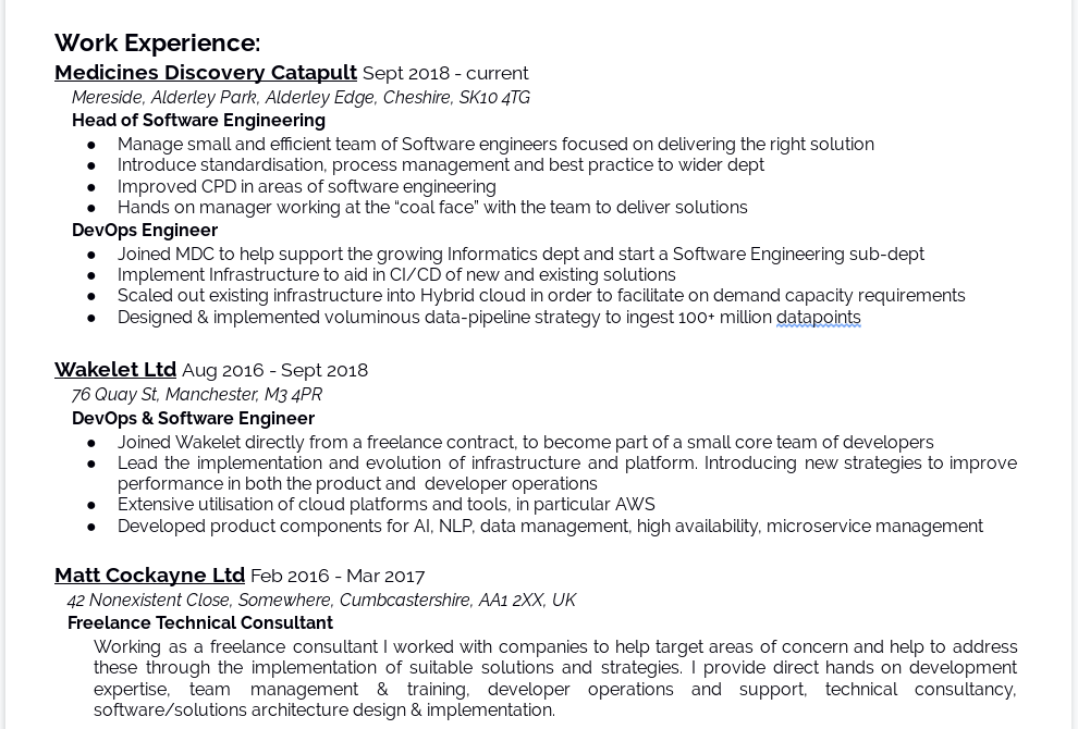
And then come back down to earth with a bump! Next up in the firing line is Work Experience. Here I define some of the previous positions I have held in my illustrious career in somewhat chronological order. I say some because I have a general rule of limiting what I put on the CV to either 10 years or 10 positions, whichever comes first. This hasn’t been a hard and fast rule over the years, and it’s fine to flex in order to suit the roles I’ve gone for. There is no reason whatsoever though to go so far back in time as to describe my time as a pot-washer when I was 17.
In some cases, I’ve also omitted some things from my CV. Somewhere in and around 2012 - 2015; I happened to found and run a co-working space in Manchester City Centre. It was an interesting venture that I’m really proud of and am glad to say is still running even though I’m no longer a part of it. But in truth, it does not add anything of value to my CV for the positions I plan to go for in the future.
To the point

I don’t like big sprawling paragraphs of text if you haven’t already got the gist. So for me, bullet points are the way forward. I try to keep it fairly obvious and detail achievements and document things I have done, and not the tools I have used.
I try to explain why I joined the company and what my purpose was. I highlight important successes and demonstrate improvements I made to the company. Short succinct sentences should be chosen to illustrate aspects of your accomplishments that actually relate to your future goals in your new position.
By doing it this way you also make it easier to tweak and change things without having to restructure a whole piece of prose in the future.
That said my own CV has a glaring exception! When I was doing freelance work I was not able to accurately describe everything I was doing due to some pesky Non Disclosure Agreements. So instead I have a simple paragraph providing a positive high-level explanation of what benefits I brought to my clients.
Formatting
There is a lot of information condensed into this section which makes could make it hard to read if left unformatted. I stuck to the font sizes I had chosen previously and decided to use a more subtle combination of indentation, italics, underline and bold to make it more pleasing to the eye and easier to scan.
Each company name acts as a subheading with a font size of 12. I take a little liberty and include on the same line the dates that I was with them. This gives a clear timeline of events that a manager can then refer to quickly when they need it, such as in an interview.
Indenting everything under a subheading makes it easier for the reader to separate out the content easily. I include an address for the company. I am not actually sure why if I’m honest, it’s just something I’ve always done. I put this in Italics mainly because it’s an aside to the core of the information.
The job title will come next in bold of course to help it stand out. Followed immediately by the relevant bullet points. My last role obviously plays the most prominent part as it’s my headliner. In the case of Medicines Discovery Catapult. I’ve held two roles, “DevOps Engineer” and “Head of Software Engineering” so I break these into their own sections within this piece of experience. Prior to that, I was with Wakelet and here I merge the two roles I held there in order to conserve space.
Education
The bulk of the hard work is now done! We have put in the sales pitch and hopefully, we are close to being invited to an interview. Time to put in some supporting information

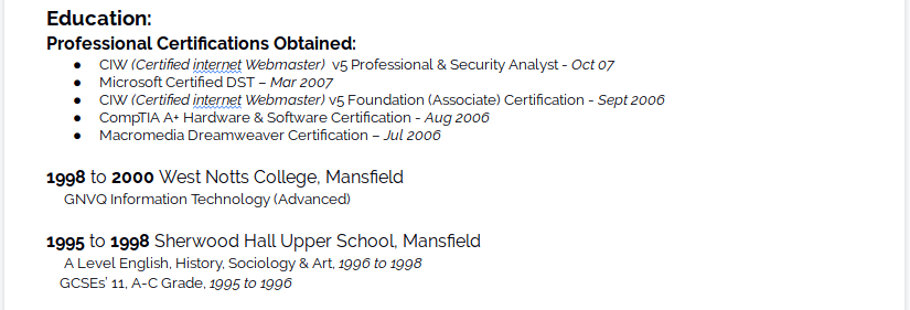
This may come as a surprise to some people but I didn’t do the whole University thing… I mean I lived in a University city and frequented the student union bars, but was never actually enrolled in a course. To this effect, I bolstered my CV when I started out by going and obtaining some (now significantly outdated) professional certifications.
Regardless of my lack of educational achievements I would always recommend keeping it simple unless it is your first position and you have no work experience (writing a CV in that situation probably needs to be another blog post entirely). List them in chronological order with some dates and a summary of what you obtained… no one needs to know that I completely fluked getting a GCSE in Art.

Were I to have a Degree I would obviously have the institution and dates in there along with my final marks. I would also look at listing the modules I completed that are relevant to my career, providing I did a Computer Sciences degree and not something like Biology. Again, it’s all about keeping to the point and providing specific information to bolster everything else you may have done.
Wrapping up
Time to finish off with a little bit of something personal. I don’t want to spend too much time here but I want to show that there is more to who I am than just work. I decided to keep it simple, a simple list of things that I enjoy doing in my spare time (When I have any, being a father of 3). The idea here is that these can become conversation pieces with the people that may be interviewing you. I’ve ended up a number of times having interviews where I talk about Scouts.

The final flourish here should be something simple but gives someone a helping hand at learning more about you if they feel so inclined. I include a link to my blog and my GitHub account, but you could include anything that may be relevant.
Last but not least… References are always available on request. My referees are varied and have changed over time. Adding them to your CV doesn’t actually impart any other information that could get you hired. Name-dropping is not the right way to get a job.
Conclusion
OK! so it’s not a pretty CV by any stretch of the imagination. It’s a bit on the long side in its full un-tailored, raw form, though not as long as it could be if I wasn’t being diligent in how I want to present myself. But this is the format I’ve used as my CV for at least 15 years now and I would say that I’ve been really successful in getting interviews out of it. I would say I get at least an 80% success rate of conversions from seeing my CV to a first-stage interview (watch me now jinx myself for the future).
A CV will never get you the job! It’s all down to you excelling in an interview situation and proving how awesome you are and that you can do everything you say you can on your CV. All it is meant to do is get your foot in the door. Hopefully, this breakdown of my CV will help you to take a look at your own CV and work on ways to improve your chances.